Itecom Giftbag Redesign
The company needs an updated design for their future endeavors, but they aren’t happy with their given design options. Needing something much bolder for Itecom’s branding, yet subtle all the wise, this is such an interesting project to work with.

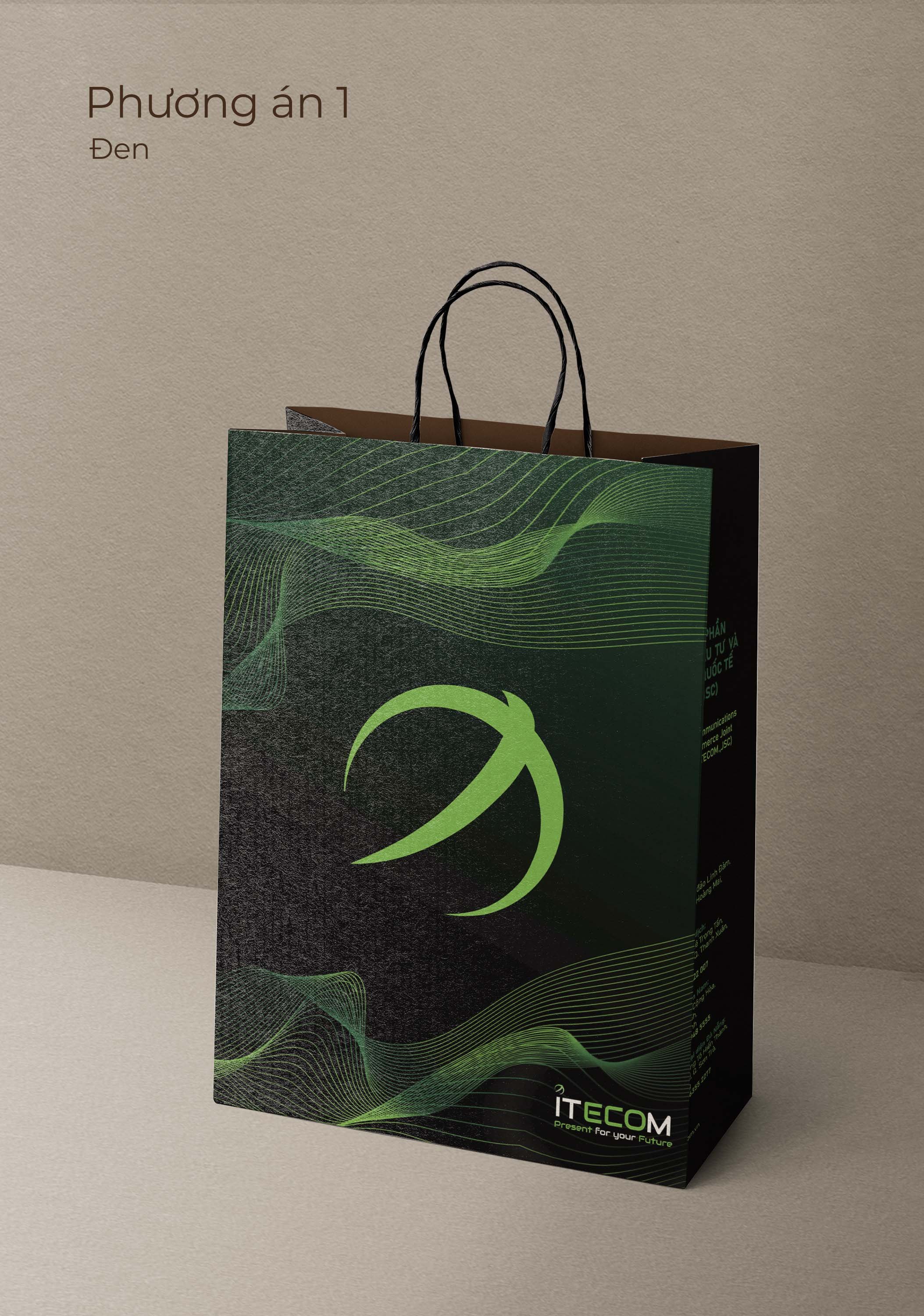
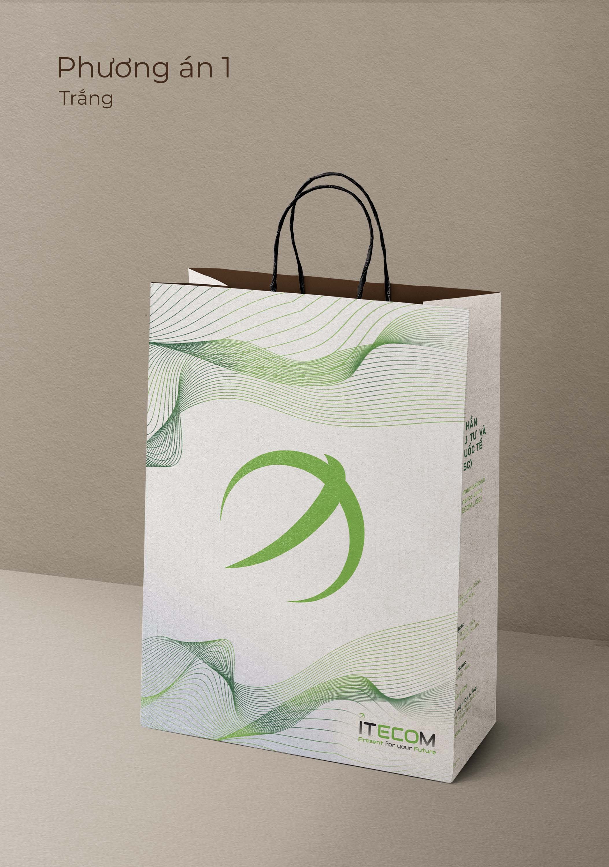
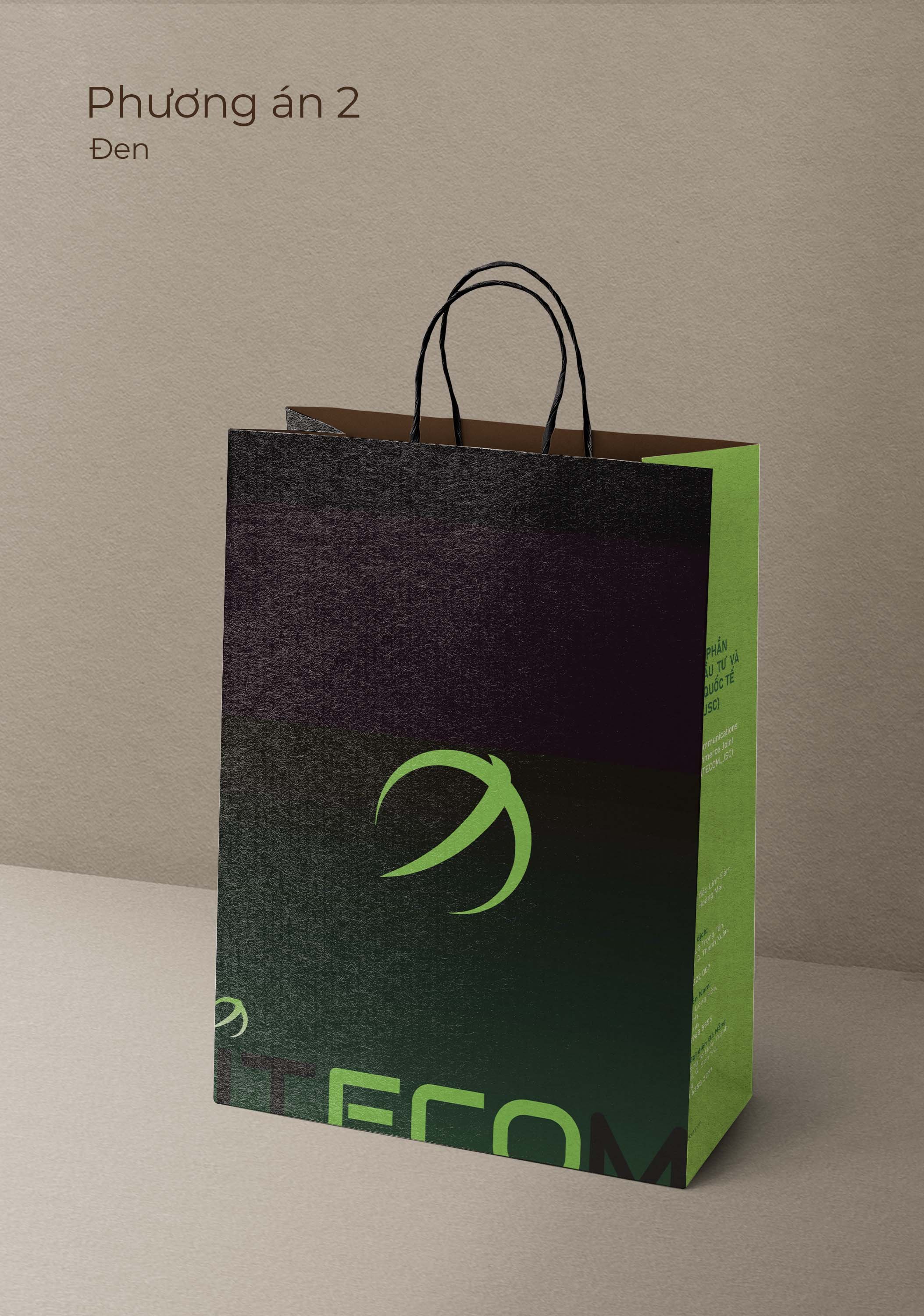
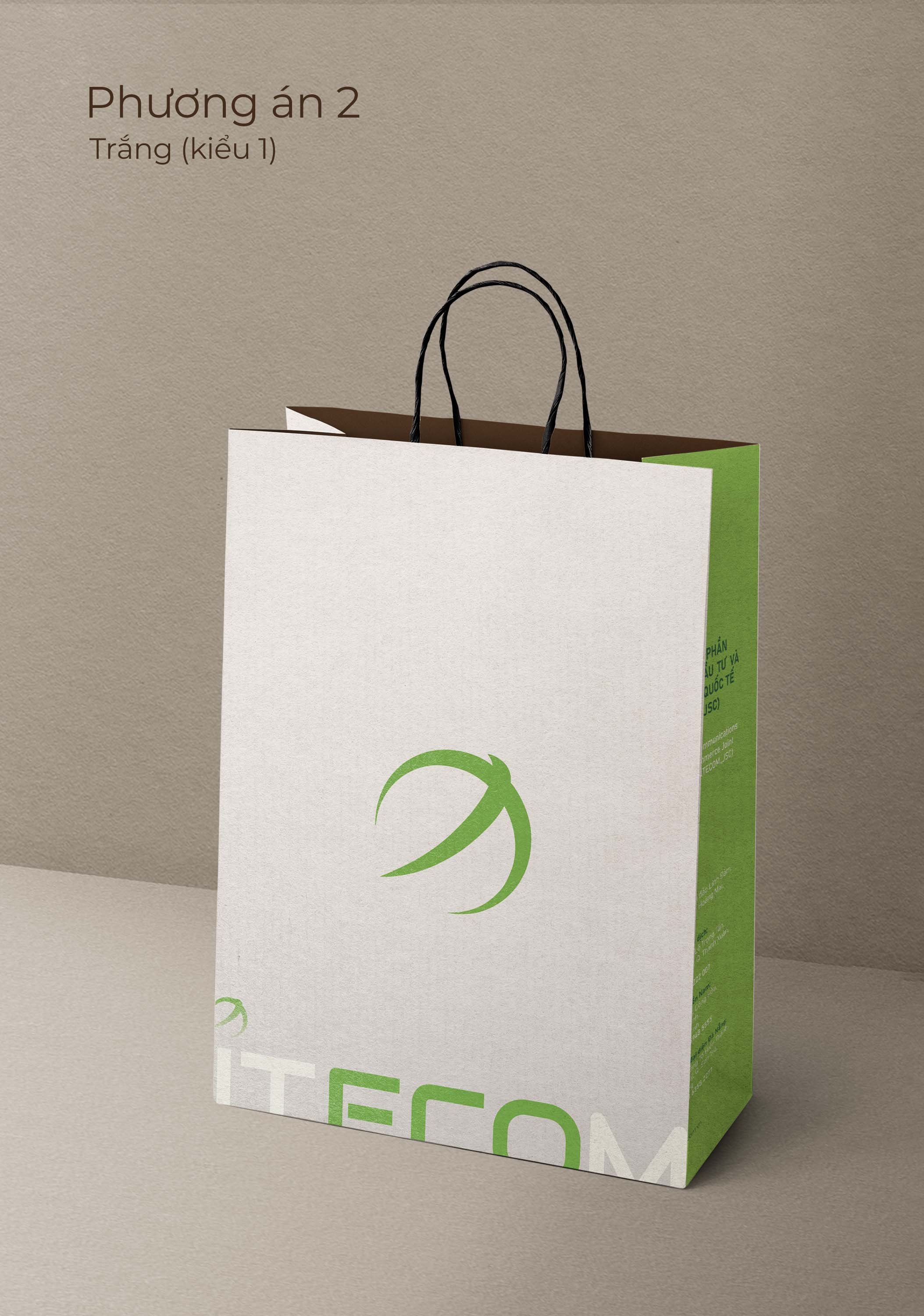
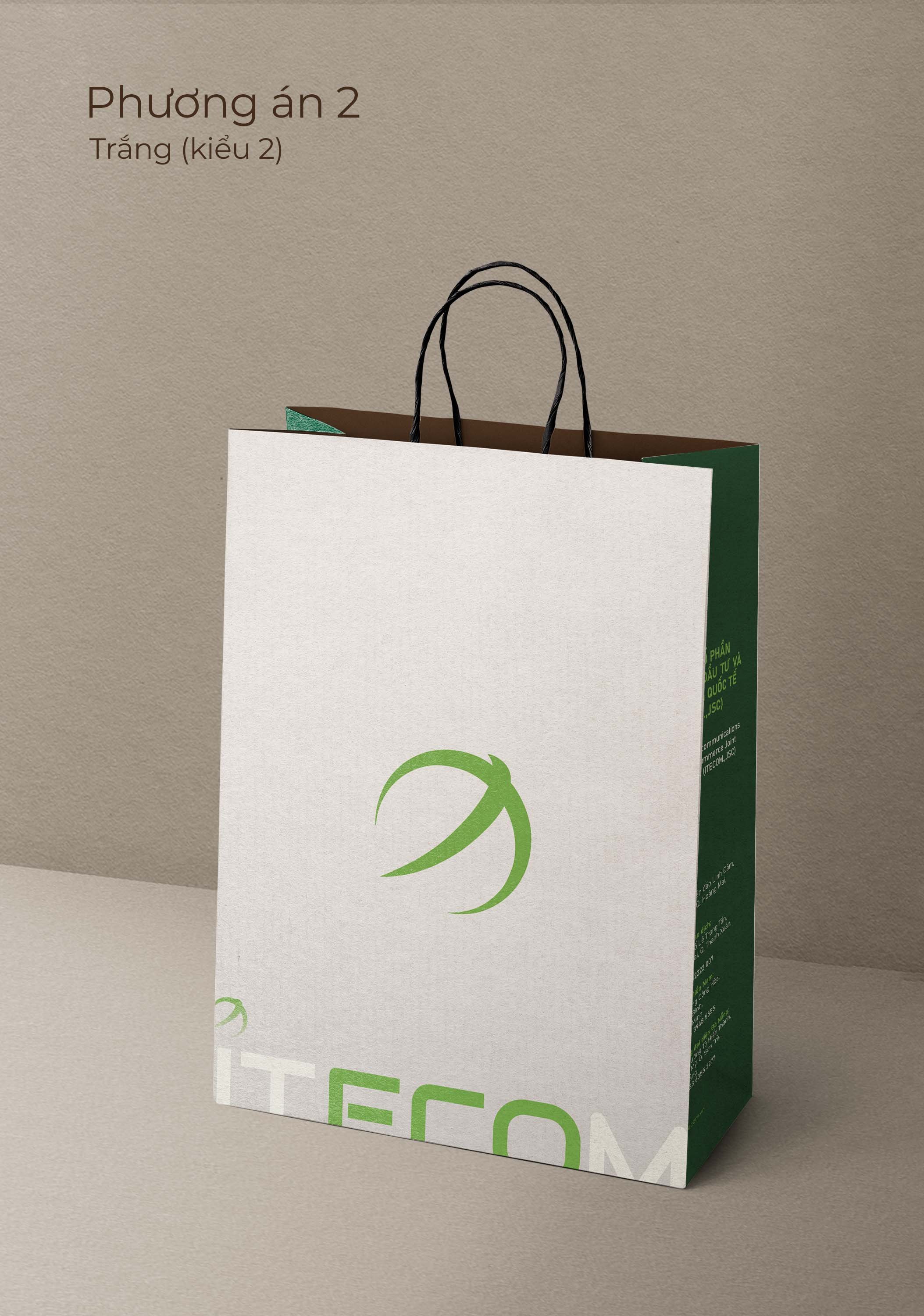
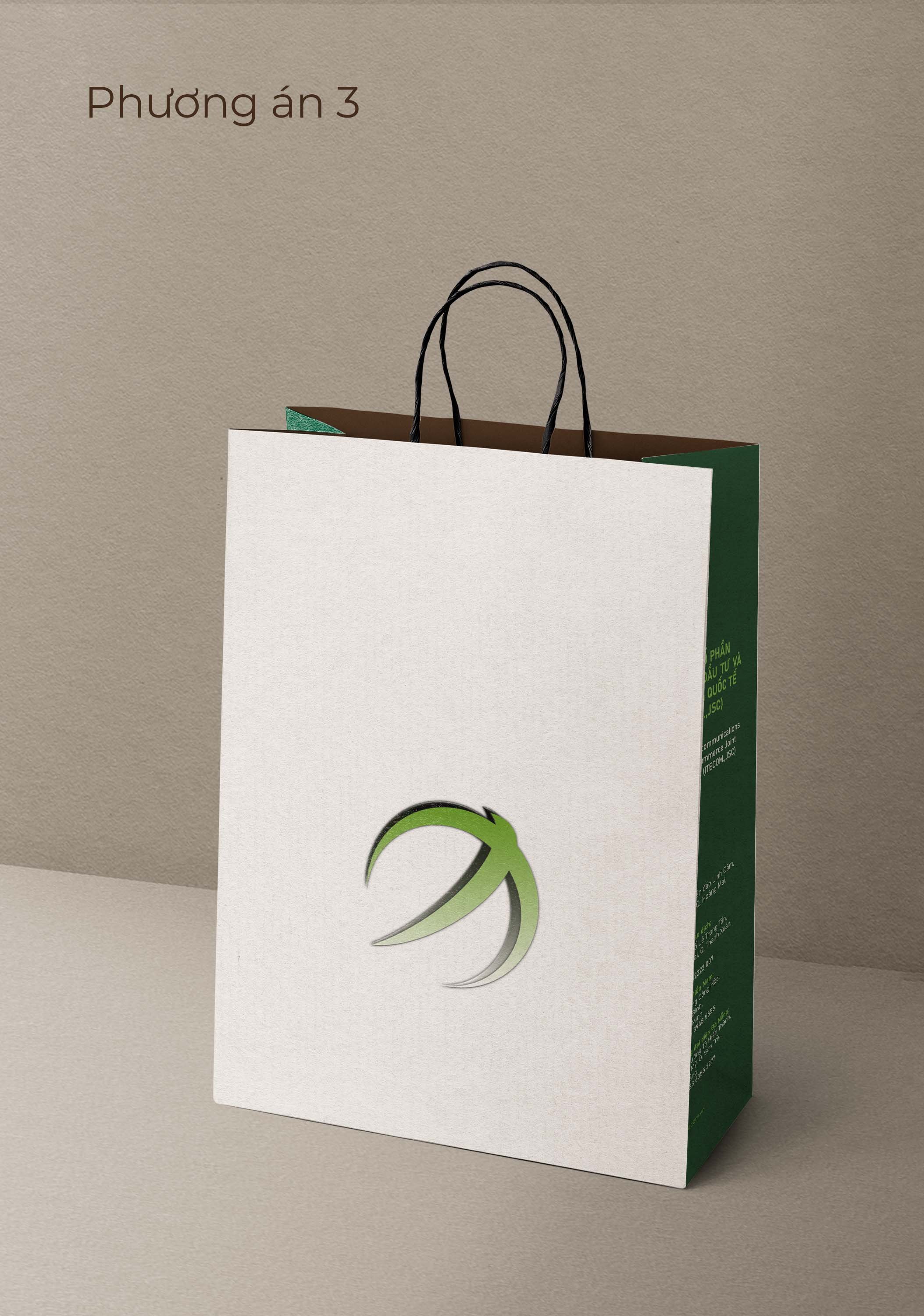
My final redesign on mockups
Paint points:
Old giftbag design was too “lousy” due to their logo’s placement and color choice, resulted the client’s dissatisfaction.
Their employees didn’t feel too comfortable handling and sending them.
The receivers felt bashful receiving items when the packaging was attention calling to their viewers.
The logo placement too straightforward, yet it was often obstructed by giftbag’s handles.
Their employee had to use a white giftbag to cover this original design, which totally against the point of having a recognizable bag/ being memorable to the receivers.
The design didn’t represent their brand’s identity.
They have a few events coming up that will utilize giftbags frequently, so they need new options Now!
Given designs’ issues:
Though they were given 6 different designs to work with from a previous design agency, the options at hand were undeniably similar to one another with minimal background changes.
With similar options, they couldn’t find out what was technically “missing” or “didn’t feel right”.
Too many dark designs.

After talking to my client, we were able to find out wh
Requirements to Solutions:
Have at least 2 designs to choose from.
Show brand’s identity. Keywords: professional, clean, tech, young.
Designs should show off logo, let it be recognizable to frequent clients, yet not attention seeking from bystanders.
my updated designs: